Monotype (NASDAQ: TYPE) today introduced the Tazugane™ Gothic typeface, the first original Japanese typeface in the company’s history. The design of the Tazugane Gothic typeface balances an original, humanistic style with elements of traditional Japanese handwriting. Designed by Akira Kobayashi, Kazuhiro Yamada and Ryota Doi of the Monotype Studio, the Tazugane Gothic typeface offers ten weights and was created to complement the classic Latin typeface, Neue Frutiger®. The two typefaces work together in a natural, seamless and adaptable manner so that Japanese and Latin texts can be used side-by-side for a wide range of applications, including in magazines, books and other print media; on digital devices; in branding and corporate identity systems; and in signage for buildings, highways and mass transit.
This Smart News Release features multimedia. View the full release here: http://www.businesswire.com/news/home/20170125005067/en/
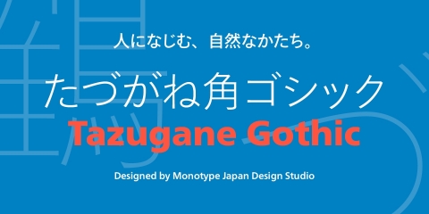
The Tazugane Gothic typeface (Photo: Business Wire)
The inspiration for the Tazugane Gothic typeface is as elegant as its design. Since antiquity, cranes have been regarded in East Asia as auspicious birds for their noble appearance and elegance in flight, and have been widely employed as a motif in works of literature and art. In Japan, the crane is a symbol of longevity, as epitomized in the saying, “The crane lives for a thousand years, and the tortoise for ten thousand.” The crane appears frequently in the Man’yoshu, Japan’s most ancient collection of poetry, where it is called tazugane. The typeface is named Tazugane Gothic in honor of the longevity of the crane, with the goal that it will be used for many years to come.
“The widely used typographic styles most familiar to Japanese audiences are steeped in heritage and history, so we set out to create a typeface that honors that tradition while being adaptable for modern environments,” said Kobayashi. “We designed the Tazugane Gothic typeface to have wide appeal, which is why it complements Neue Frutiger so well. The trend of using Japanese and Latin texts together in various media is only increasing, so the two typefaces create a much more pleasing and consistent experience for readers, whether they’re looking at a screen, reading a sign or engaging with a brand.”
When Japanese and European fonts are used together in the same text, the Latin alphabet often looks smaller in comparison to Japanese type. To avoid this problem, the Tazugane Gothic typeface includes a larger version of the Neue Frutiger typeface with a downward-shifted baseline. When written vertically, the Latin type has been shifted slightly to the right. Additionally, the counters of the Tazugane Gothic typeface have been designed to be smaller and narrower to preserve the balance of traditional handwriting taught in schools and generate a natural rhythm when the type is set. These adjustments result in a flexible typeface that allows Japanese and Latin characters to be used together with a uniform look that improves legibility and consistency.
Suggested Typeface Pairings
While the Tazugane Gothic
typeface was designed to pair with an adjusted version of the Neue
Frutiger typeface, it also pairs well with other Latin typefaces,
including the Neue Helvetica®, FF DIN®, Avenir®
Next and Syntax® Next typefaces.
The combination of the Tazugane Gothic typefaces’ traditional and humanistic elements, along with its intended ability to complement popular Latin typefaces, makes it one of the most uniquely flexible designs for applications where Japanese and Latin texts can be used together.
Pricing and Availability
Single weights of the Tazugane
Gothic typeface are available for $179, and the complete 10-weight
family is available for $999. The Tazugane Gothic Body Text Collection,
which includes Light, Book, Regular, Medium and Bold weights, is
available for $599. The Tazugane Gothic Headline Collection, which
includes Ultra Light, Thin, Heavy, Black and Extra Black weights, is
available for $599. All Tazugane Gothic typeface packages will be
available at a discounted price of 50 percent off through March 9, 2017.
The Tazugane Gothic typeface family will also be available through MyFonts.com, Fonts.com, Linotype.com and FontShop.com, and also with a variety of licensing options for customers through Monotype enterprise sales.
To join the conversation about the Tazugane Gothic typeface online, search #Tazugane on Twitter, Facebook and Instagram.
About Monotype
Monotype is a leader in empowering expression and engagement through a combination of type, technology and expertise. Headquartered in Woburn, Mass., Monotype provides customers worldwide with typeface solutions for a broad range of creative applications and consumer devices. The company’s libraries and e-commerce sites are home to many of the most widely used typefaces – including the Helvetica®, Frutiger® and Univers® families – as well as the next generation of type designs. Further information is available at www.monotype.com. Follow Monotype on Twitter, Instagram and LinkedIn.
Tazugane is a trademark of Monotype Imaging Inc. and may be registered in certain jurisdictions. Helvetica, Monotype and Syntax are trademarks of Monotype Imaging Inc. registered in the U.S. Patent & Trademark Office and may be registered in certain other jurisdictions. Avenir, DIN, FF and Frutiger are trademarks of Monotype GmbH registered in the U.S. Patent and Trademark Office and may be registered in certain other jurisdictions.
View source version on businesswire.com: http://www.businesswire.com/news/home/20170125005067/en/


